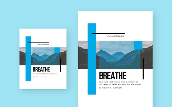
Learning more about flyer design is a great idea if you have any type of venue or business. This type of advertising is a very economical and efficient way to publicize all kinds of events and promotions. That is why more and more companies of all sectors and sizes use it.
It is important to keep in mind that quality and design weigh heavily in the results. What’s more, a mistake or unprofessional creativity can even have a negative effect on our brand and reputation.
To help you achieve the best results, in this post we will share tips and tricks to help you become an expert in flyer design. We start from the beginning by explaining what a flyer is and what are the most common formats used in advertising. Then, we offer you tips to design it from scratch and we end with a series of tips to succeed. You can also consider online print shop for the designing and printing in highest quality.
What is a flyer?
Flyers are a printed advertising format that refers to small and medium-sized brochures that we use to publicize any event, product, promotion or service. A curious fact is that these receive their name from the verb to fly (to fly) since at first they were distributed by launching them from airplanes.
Currently, flyers or flyers are one of the formats most used in advertising and marketing thanks to their low cost and they allow us to connect face to face with potential clients.
With regard to the different formats, in Print sale specifically you can find seven different sizes and shapes. We tell you which ones you can choose below:
- A4 Flyer: An option in folio size that you can print on one or both sides in portrait or landscape format. They are generally used as fact sheets for products.
- Flyer A5: It is one of the most used formats together with the A6. It measures half a sheet of paper. Its measurements are 14.8 x 21 cm, which makes it perfect to hand-deliver or use in mailboxes.
- Flyer A6: Its use is similar to the previous format but it is much smaller. It measures a quarter of a folio or, in other words, 10.5 x 14.8 cm.
- Flyers B6 or DL: Formats specially designed to be used vertically, measuring 10 x 21 cm and 10.5 x 21 cm respectively.
- Square flyers: They stand out for their original format and are available in several different sizes.
- Mini flyers : Our smaller options, from which you can choose the A7 (7.4 x 10.5 cm) or A8 (5.2 x 7.4 cm) format
- Round flyers : A very striking option if you want your advertising to stand out, available in three different sizes to choose from.
Tips for designing a flyer
If the advantages of this type of advertising have convinced you and you want to start promoting your business, the next thing you have to do is start designing. Before you start, take note of these tips:
- Consider what the objective is: The flyer has to have a clear and concise message so that the person who receives it is clear about what we are telling them. Focus on just one idea and how to tell it in a clear and simple way.
- Design from top to bottom: This format is intended to be read so the most important part has to be where we would start to do it, the upper left part.
- The important thing has to stand out: What do you want to tell? Put it big. The objective is that even if the receiver does not stop to read it carefully, just by taking a look, they will find out what we are offering.
- Legible contact: It is essential that the way to contact us is clearly visible and legible. It can be the address, phone number, website, etc.
- Design it “full bleed”: That is, do not include the white print borders. This will create a more professional and confident feeling.
Tips to succeed
In addition to the basic design points, if you want to go further and create a campaign with a much higher chance of success there are a number of extra points to pay attention to. For starters, don’t forget to include calls to action (CTAs). That is, a “Call us” or a “Buy it now.”
On the other hand, if you have the necessary tools, analyse who your target audience is and what interests them before starting to design the flyers. It is impossible to create an option that everyone likes so we recommend you focus on something tailor-made for your potential clients.
Lastly, don’t forget that quality comes first. Both in the choice of images, seeking that they are of good size, original and that go according to the theme; as with the service offered by the company you trust to print your flyers. If you want a professional finish of the best quality, remember that you will get the best results on brochure printing Canada.


