Visual marketing is all about creating a relationship between the objects and the context of the images. This marketing concept is of great importance to email marketers as it helps them establish the brand’s identity and aesthetics. Email marketers have also adopted other visual elements beyond images to circumvent some of the restrictions of certain email clients. Illustrations, fonts, colors, etc., can all be used as a visual medium. For inspiration, you can browse HubSpot’s online library to find the best HubSpot email templates.
What are the visual elements in an email template, and how to make the most of them?
- Images
Images can act as great visual cues for your brand aesthetics. There are some best practices that email marketers need to follow to make the most of using images in emails. To begin with, try to maintain the text-to-image ratio at 80:20. While this ratio is not set in stone, it gives the best result compared to others. You are free to test other text-to-image ratios in your email campaigns. Avoid using image-only emails as they are more likely to trigger spam filters. Finally, always use high-quality images in your emails.
Munk Pack celebrates National Peanut Butter Lover’s Day with a stunning email. They have used original high-quality images rather than choosing a stock image. This image is sure to get the readers craving for one of the bars. As for the rest of the email, they have used another image with illustrations. The choice and use of colors are also immaculate.
- Illustrations
If you are facing trouble visualizing your brand aesthetics with images or videos, you can always create custom illustrations. Illustrations can help your customers visualize abstract products and services. Infographics, symbols, diagrams, and illustrative guides can simplify complex procedures into simple walkthroughs. Lastly, illustrations help you establish your visual brand and enhance the appeal of your emails.
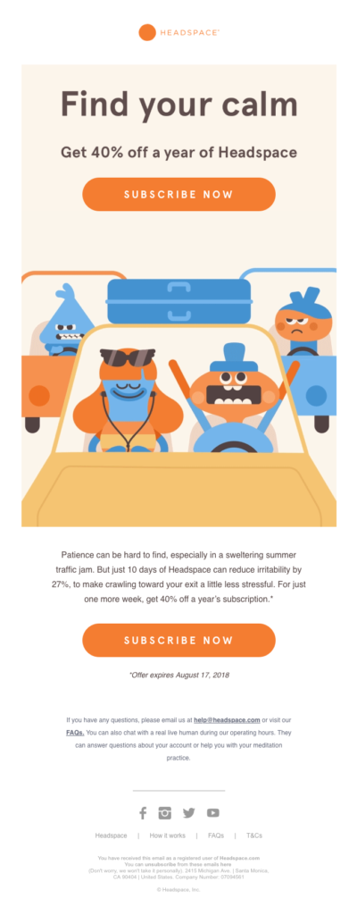
The illustrations used by Headspace have become very recognizable. The illustrations will generally have rounded edges to look more welcoming and warm. All the email campaigns run by Headspace use similar illustrations. Even their ads, images, and videos on other social media platforms depict characters with this design, thus, bringing consistency to their brand aesthetics across all marketing channels.
- Fonts
The fonts used in your email also dictate the aesthetics of your brand. For example, email marketers use cursive fonts to give their template a classy look and use monospace to create a minimalistic look. Email marketers can create their custom fonts to match the pre-existing aesthetics and identity of the brand. Moreover, these custom fonts make the emails stand out in the subscriber’s inbox. Expert email marketers recommend that you should compulsorily use a couple of fallback fonts if you decide to create custom fonts for your email template.
Bird Rock Coffee uses a combination of custom and regular fonts. They use hollow letters to highlight the headings and other important information. They have also used cursive in their email copy. The rest of the email uses serif fonts.

- Colors
Colors are one of the more important visual elements in an email template. Using the right colors with your email copy can convey your messages and intentions more clearly. If you are planning to use more than one color in your design, ensure they complement each other. The trend of using color gradients in email templates is also rising as it helps cut through the mundaneness of ordinary graphics and makes the email more sophisticated. In addition, you need to optimize your colors to work well with dark mode because more than 91% of the email users are now preferring this mode.
The colorful promotional email from the Finn shows the true potential of this visual element. The brand presents a fun and quirky aesthetic. Coming to the email, the bright orange header highlights the perks and features of becoming a subscriber. The deep blue and the mauve colors create two blocks for the templates. The upper portion is used for the email body, and a lower part is used for highlighting their products. The deep blue also serves as the perfect backdrop for the colorful product line-up. In the email copy, Finn uses a gradient-colored underline to highlight the USP of the brand. The attention to detail is unmatched.

The importance of visual hierarchy
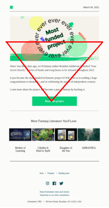
The visual hierarchy ties all the various elements together and draws the reader’s attention to all the necessary parts. In other words, setting a visual hierarchy with the other elements will help the readers skim through your email content more easily. Usually, the visual hierarchy is an inverted triangle that starts with the hero image and ends at the CTA button. Most of the HubSpot email templates come with this hierarchy. Its online template library also hosts hundreds of the best HubSpot email templates. You can also create a visual hierarchy using gradient colors.
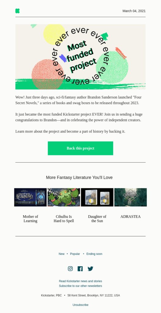
Kickstarter’s simple announcement email follows the inverted triangle hierarchy. The illustration becomes the base of the triangle that narrows down to the bright green CTA button. The white background of the template also makes the CTA button pop.
Conclusion
With visual elements, there is always a risk of overwhelming the reader with all the details. Therefore, it is wise to test all your templates before running the campaigns. Try to keep it as unique as possible to increase your chances of grabbing the customer’s attention.
Author: Kevin George is the head of marketing at Email Uplers, that specializes in crafting Professional Email Templates, PSD to Email conversion, and Mailchimp Templates. Kevin loves gadgets, bikes & jazz, and he breathes email marketing. He enjoys sharing his insights and thoughts on email marketing best practices on email marketing blog.

