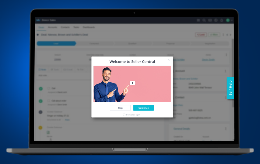
A product tour is known to guide a new user through Saas UI along with key features. It is also known as product walkthrough they are of help to a SaaS company to simplify the on- boarding process.
An overview about a product tour
A myth exists that a product tour is an automated version of the on- boarding process. But it is more than a pop- up that is going to provide feature overviews. A modern product tour may emerge in the form of an interactive walkthrough, beacons, or explainer videos that will allow the users to have an idea about the flow of work. Such patterns would be providing conceptual guidance and with the new users formulate a handy impression. A strong first impression has a telling impact on the product adoption as compared to the traditional on boarding process.
For user on- boarding why resort to the use of a product tour
If the product tour is well designed it would streamline the on boarding process. It would be of help for the new users to understand the features or UI elements in comparison to things if they had to learn on their own. More sophisticated a product, it is vital to have a product tour, which would be guiding you through the learning curve.
The main objective of a user on boarding is to make sure that the users are able to figure out the value of your product as soon as possible. Such recognition of the value is known as a aha moment as it may lead towards forward activation along with product adoption at a major level. An effective product tour would streamline the aha moment in various ways as follows
- It is bound to simplify the experience of an user- a product tour is known to simplify a Saas curve by teaching users to be using a feature that would be relevant to their role
- They drive meaningful action- an effective form of product tour would facilitate swifter action rather than providing a passive overflow of the key features. Such learning by doing would enable knowledge retention which means that an user may be able to master your product quickly
- Improves engagement- a well -designed product would be reducing the fiction in an on boarding process. When it is well done it enhances your product adoption rates and it goes on to reduce the in-bound calls reducing the need for manual training.
The features necessary to build an effective product tour
When it comes to an effective product tour they are likely to comply with a few guidelines. No one in size approach is not going to work when it comes to the question of designing product tours. But if you are following on such basic principles for a new user it would reduce the downtime.
- Personalization turns out to be the key- for all the new users there is no point to develop a generic product. There is a need to segment the product tours according to the roles so as to provide a personalized experience to the users
- With user action trigger product tours- all the product tours would not initiate once an user logs into a product. it would be necessary to segment them as per action of the users that would seamlessly appear in the proper context.
- User cases along with UI patters are to be matched- the choice of a proper UI pattern may prevent the tutorials from becoming disruptive. An example is a pop up message would welcome the visitors on the website but toolkits would be more than helpful for explaining a particular feature of a product or a service.
- The key is to have an idea about the whys- the key is to motivate the users to take action based on the whys, prompts along with tutorials. There is no point to provide generic tips and ask an user to do something. Once you are able to convey the after effect of your actions an user will be motivated to deal with a product
These are some of the features of a product tour.


