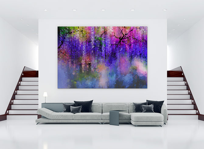
Minimalism first appeared on the scene in the late 1960s. It stands out for its severe form of simplicity and clear, objective approach. Minimalism began as an aesthetic movement to demonstrate the language of simplicity, rather than as a design technique.
The famous saying “less is more” has formed the foundation of minimalism. This approach influences other fields, including the design industry. A design agency is occasionally required with the rising trend and popularity of the minimalistic design. They, like Limeup, may have a modern take on minimalist design that will appeal to your intended audience.
Minimalism as a design technique is still a new concept for designers. It is still evolving and continues to progress by keeping up with the latest trends. Minimalism as a design style, in layman’s terms, includes the most crucial aspects of content. This is accomplished by removing excess and unneeded components. As the saying goes, less is more.
As someone who wants your brand to be perceived positively by the public, we must give them a good experience. The way people engage with and consume your material is an important factor to consider.
In this post, we’ll go over the basic principles of the minimalist approach and how it may help your brand.
5 Principles of Minimalist Design
Principle 01: The Art of Less
A minimalist design is intended to be simple. We can do that by mastering the art of doing less. By stating less and simpler, we do not suggest that the material would be plain, monotonous, and dull. What we need is a visual hierarchy that directs users’ attention to the most significant subject above the other items that we have laid down.
The goal behind art of less is to produce a visual impression without sacrificing the content due to over-elaboration of the design elements. Using simple graphics and removing unnecessary elements is an example of practicing the art of less.
Principle 02: Convey Delicately
According to Goodfirms, 84.6% of respondents believe that overcrowded elements in a site’s design make visitors unpleasant. A design ought to convey delicately so that users get a sense of lightness.
Minimalist design should be calm to reflect modesty while expressing elegance and refinement through detail. We can accomplish this by employing simple components like colors, fonts, and white space.
There is a misperception that minimalism equals black and white. Yes, it might be black and white, but it can also go beyond that. Colorless design is not integral to minimalism. It may also include colors if you know how to play and use them correctly. The selected color should be used carefully and consistently.
Typography plays a role in conveying content in a delicate manner. You should opt for a readable font that is not so overwhelming that it can distract from the content. White space is also important since it helps your content appear properly balanced and coordinated.
Principle 03: Repetition is the Key
The technique of repetition ensures that the design is consistent. Repetition may be used in any design aspect, such as:
- In terms of colors, use the same color palette.
- By employing coordinated, readable fonts in typography.
- In objects, the same shapes and icons are used.
This results in a neat appearance that is visually pleasing to the human eye.
Principle 04: Coordination and Proper Alignment
Coordination and proper alignment are critical for the overall appearance of the content. By doing so, we can create correctly ordered and systematic material that the audience can easily take in since they are not lost when absorbing the information.
Minimalism seeks balance and harmony at all times. The use of proper alignment and coordination can bring minimalism to your content by allowing you to create a clean design.
Principle 05: Emphasize Functionality
Regardless of the design components that must be considered, the functioning of the brand should remain the top priority. There should be a balance, which implies that the material should be well-executed, demonstrating the value of aesthetics without sacrificing its essential functioning and utility.
Make sure the attention is on the brand. A minimalist design is meaningless if it compromises or weakens your essential message in any way.
Conclusion
Overall, minimalism’s simplicity makes it a versatile strategy that may be used in a variety of industries.
From art movement to design technique, minimalism presented itself as one of the notable designs. We can discover aspects of minimalism not only in design and art but also in some fields, making it timeless.
The less is more trend will continue to dominate and adapt in order to match with the shifting trends, but one thing is certain: the origins of this method will stay.
So, if you want a design that accentuates clarity and consistency while also providing a better experience to your users, then consider minimalist design!


